HowbyWhyBrand Strategy & Creative DirectionIndependent Practice
Clarity for brands at a turning point.
Start with the problem.
 SUB:3Bending Time & Space · ·
 Named after the holy grail of marathon running, breaking the three-hour mark, SUB:3 is built on discipline, obsession, and the pursuit of possibility. At its core is the notion of Bending Time & Space, where time stretches, compresses, and distorts through effort.
 KOJAUnapologetically Good · · · ·
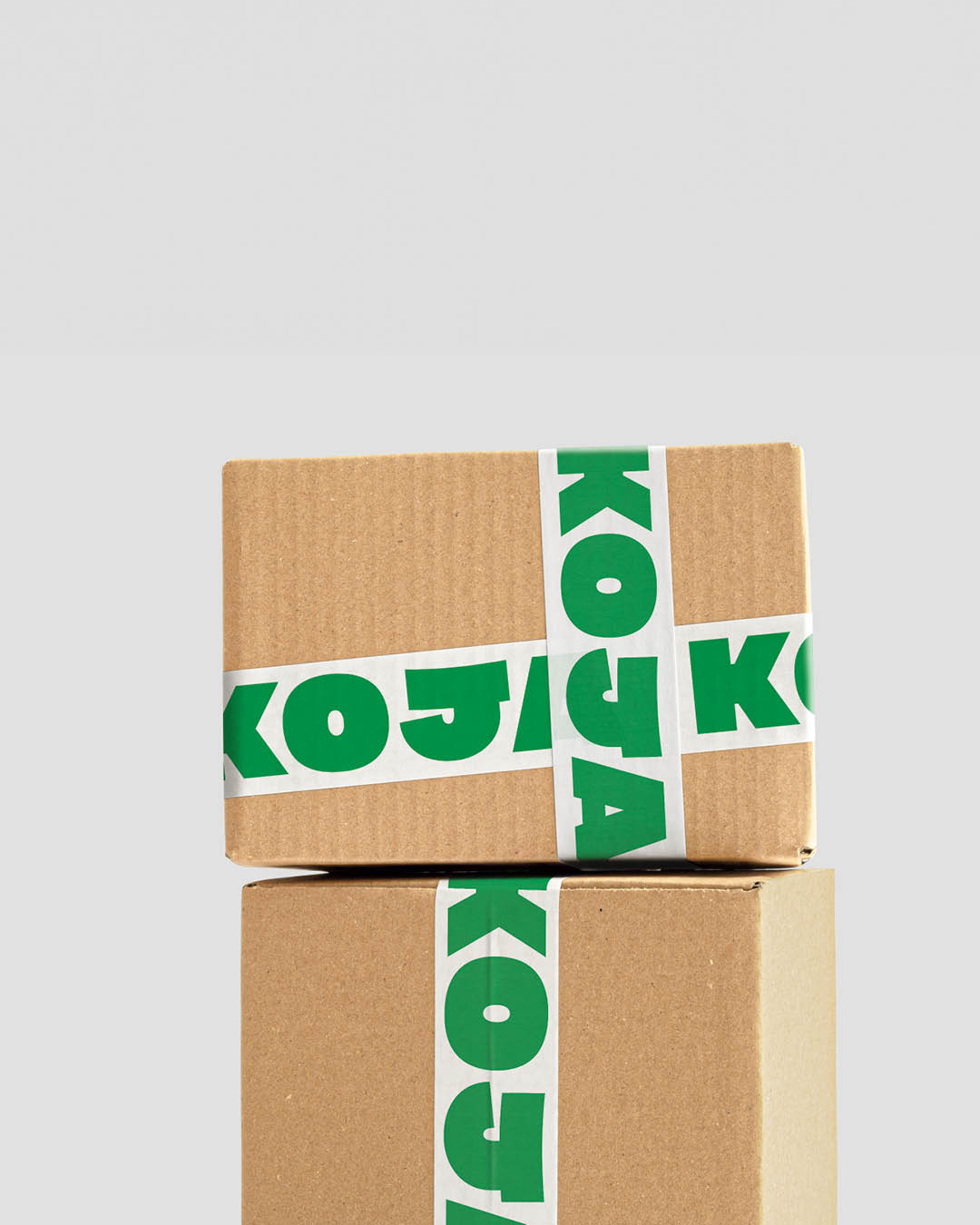
 KOJA exists to make healthy simple. Built on real ingredients and straight-talking values, the brand cuts through the noise of the category with clarity and confidence. At its core is Unapologetically Good, a belief that good food doesn’t need dressing up, it just needs to be good.
 CLOSEDA Smuggler’s House · · · · ·
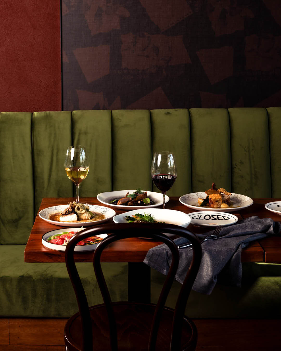
 CLOSED is built on the idea of A Smuggler’s House — a space shaped by secrecy, intimacy, and belonging. The name reflects this directly. What appears closed becomes an invitation, revealing a place where privacy meets connection, and hidden moments are shared.
 Chris SisarichBeauty Amongst The Mundane · ·
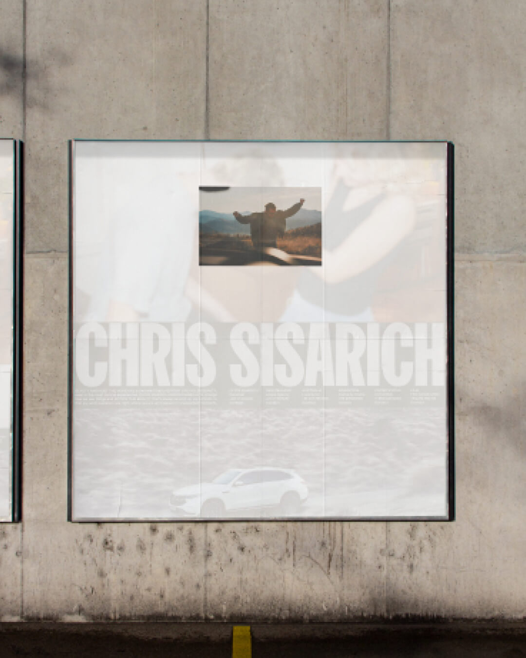
 What we see is shaped by how we choose to look. Chris Sisarich is built on Beauty Amongst The Mundane, a way of noticing what’s already there. The everyday, often overlooked, observed with intent and sensitivity. It’s not about adding meaning, but revealing it. A shift in perspective that turns quiet moments into something worth holding onto.
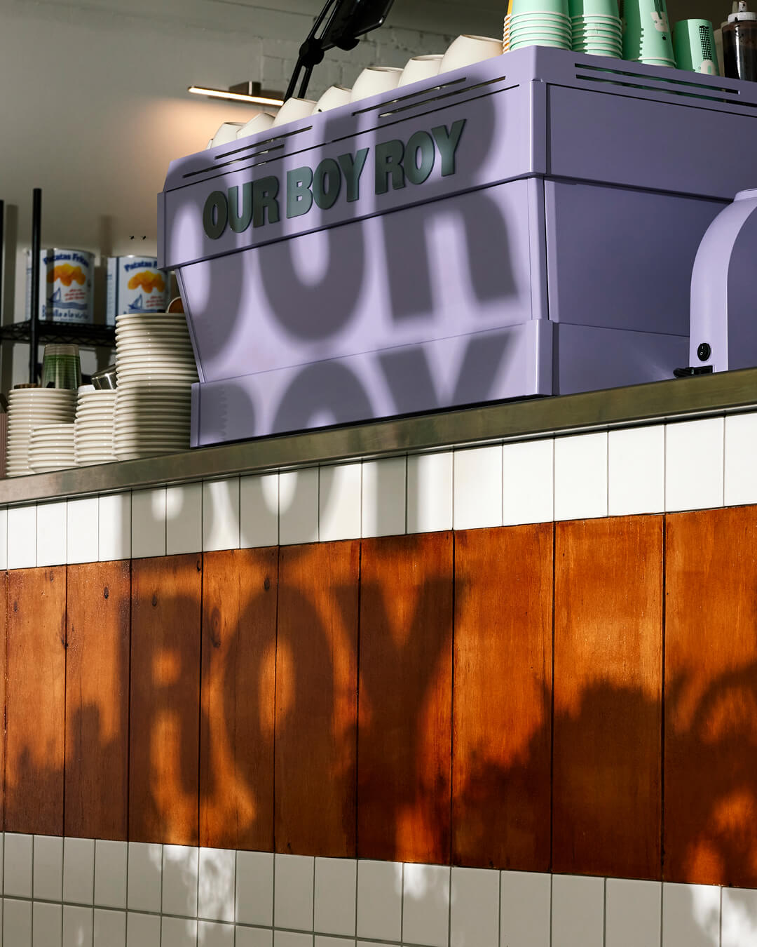 Our Boy RoyThe Friendly Neighbour · ·
 Some places feel familiar before you’ve even been. Our Boy Roy is built on that feeling. A neighbourhood spot shaped by warmth, personality, and ease. At its core is Our Boy, a character that holds it all together. Not a figure, but a reflection. Of people, of place, of the everyday moments that make somewhere worth returning to.
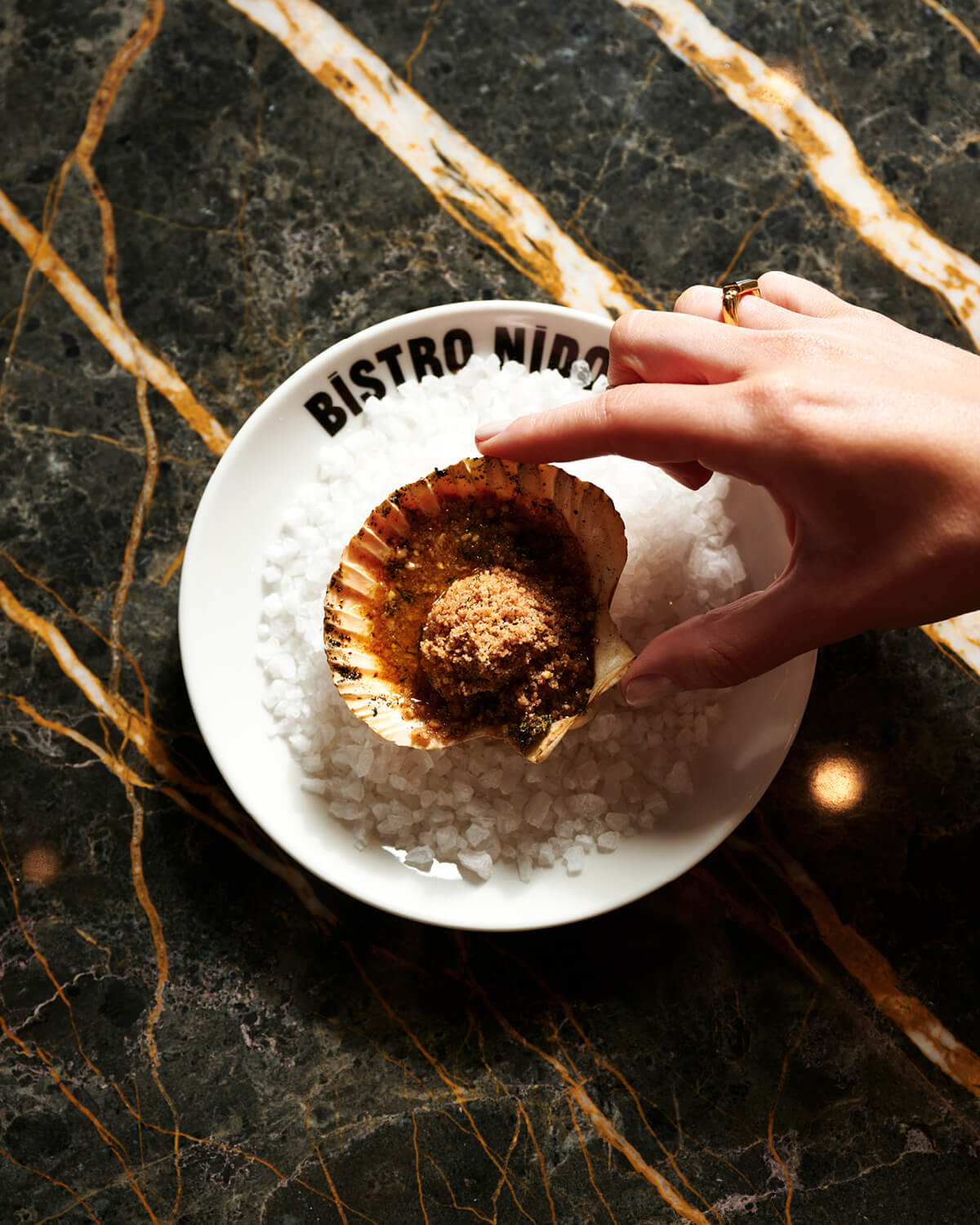 Bistro NidoTwice Cooked ·
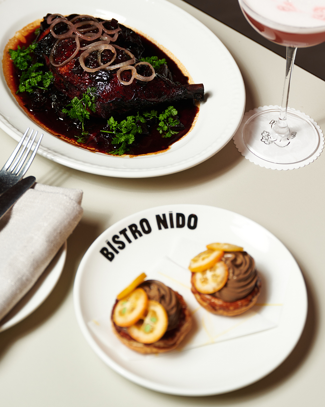
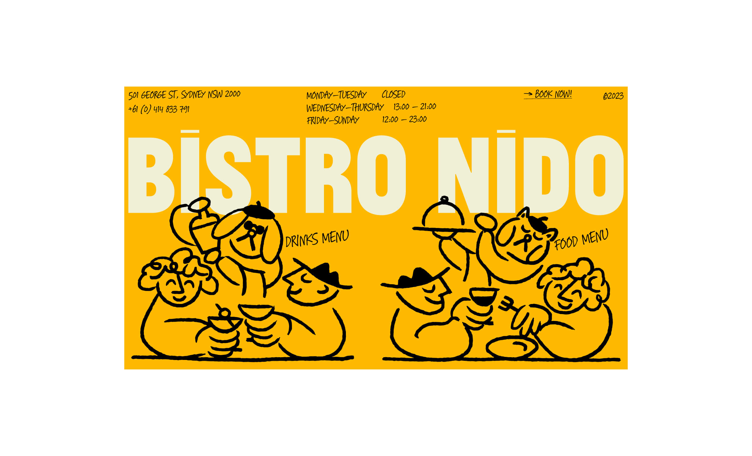
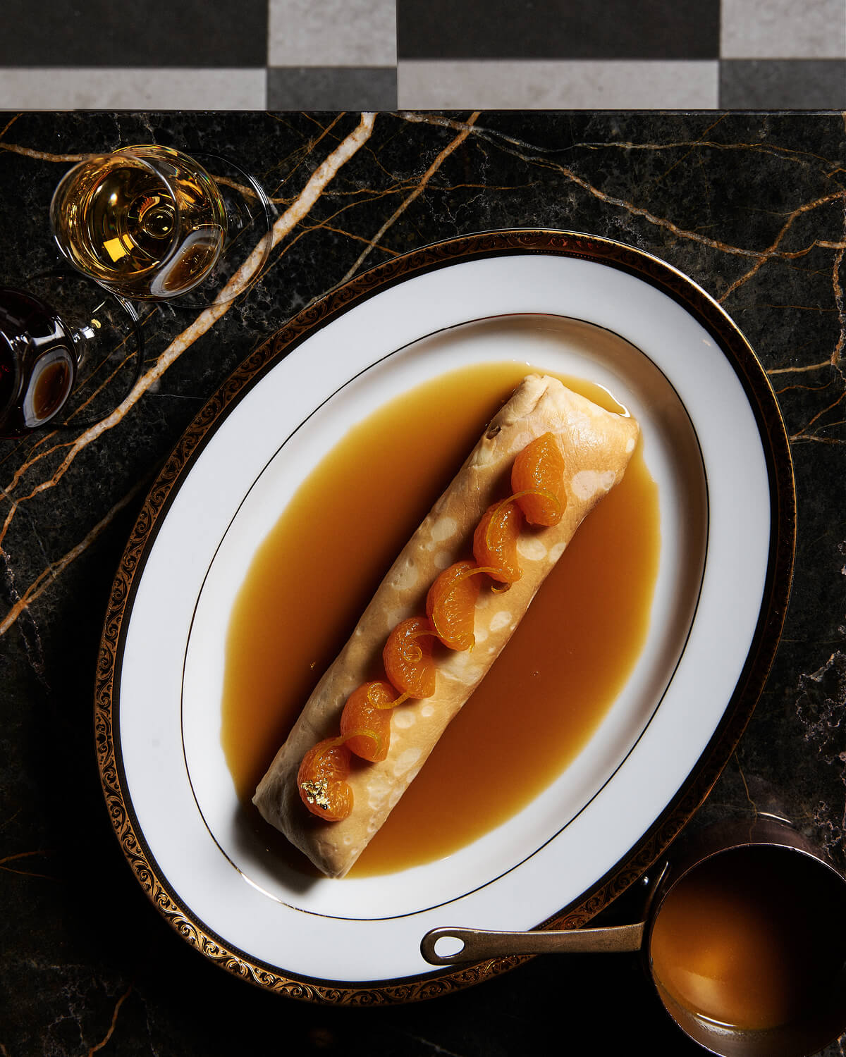
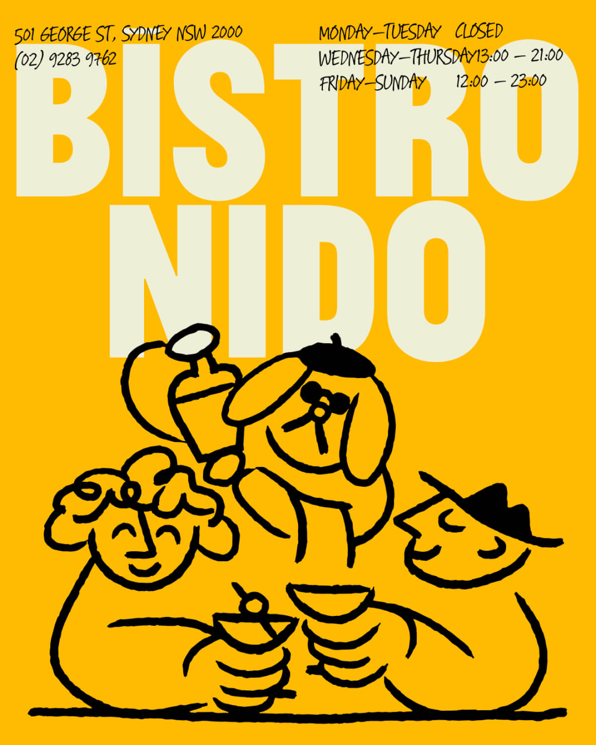
 Bistro Nido is built on a simple, honest premise: cuisine du marché — cooking from the market. A 40-seat modern bistro at 501 George Street, Sydney, it draws from French bistro tradition while weaving in Japanese technique and ingredients throughout. The concept is called Twice Cooked — a culinary approach to everything, including the design. Two cultures, two influences, one place worth returning to.