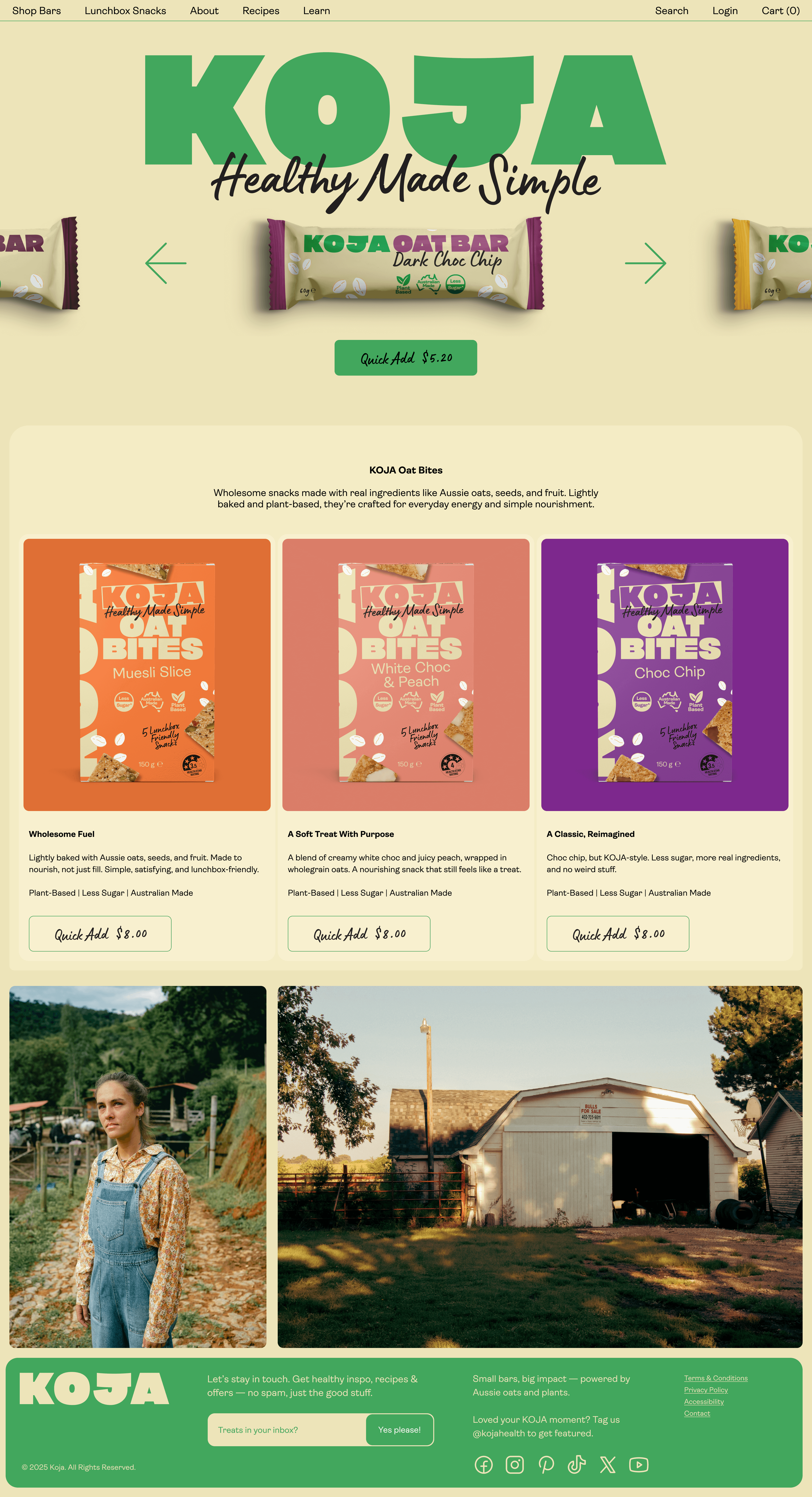
The Idea
KOJA exists to make healthy simple. Built on real ingredients and straight-talking values, the brand cuts through the noise of the category with clarity and confidence. At its core is Unapologetically Good, a belief that good food doesn’t need dressing up, it just needs to be good.
The Shift
The health snack category often overcomplicates what should be simple. Long ingredient lists, layered claims, and careful language create distance between the product and the person. The opportunity was to strip it back. To say less, but mean more. The shift came in removing the need to justify. If it’s good, it’s good.
The System
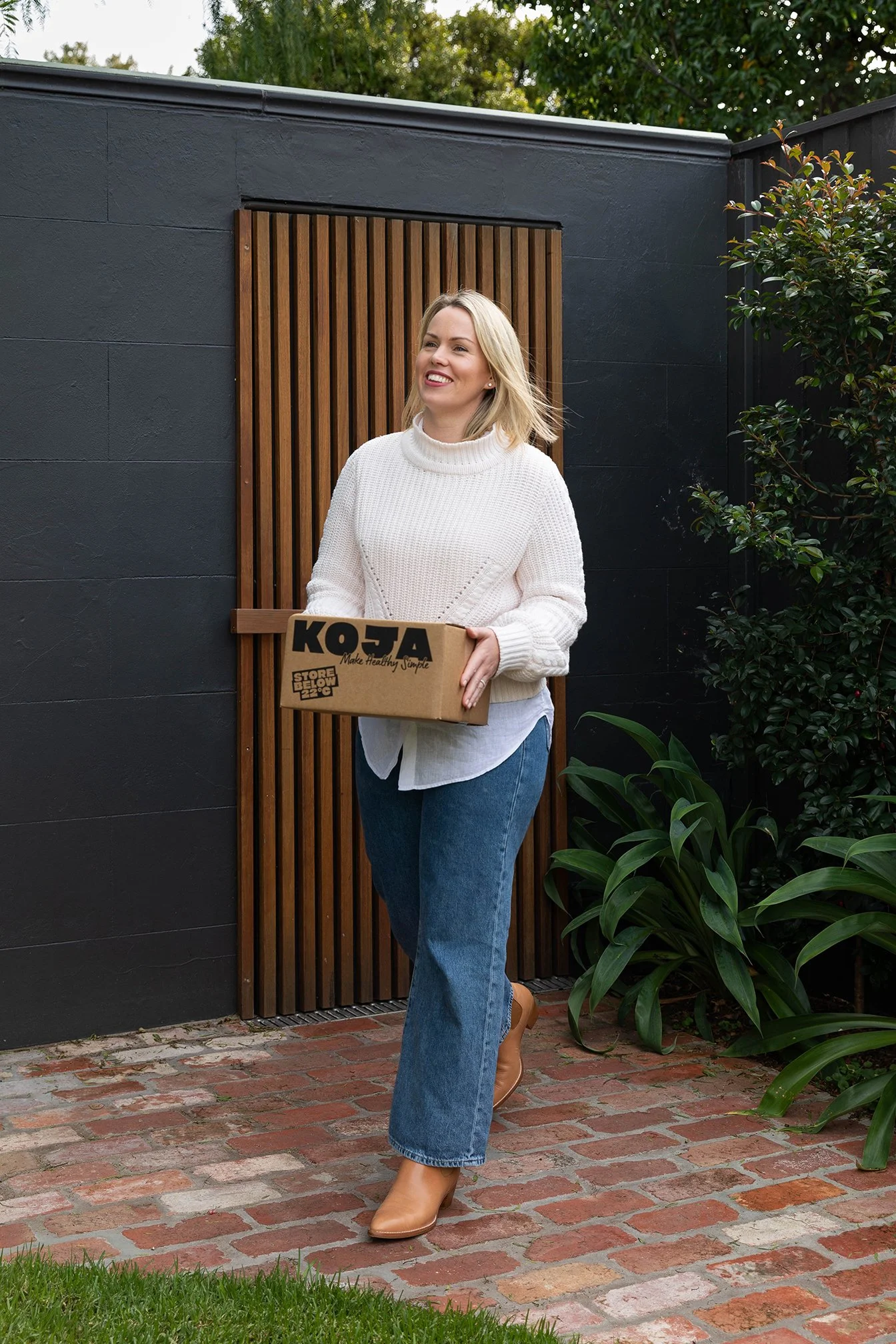
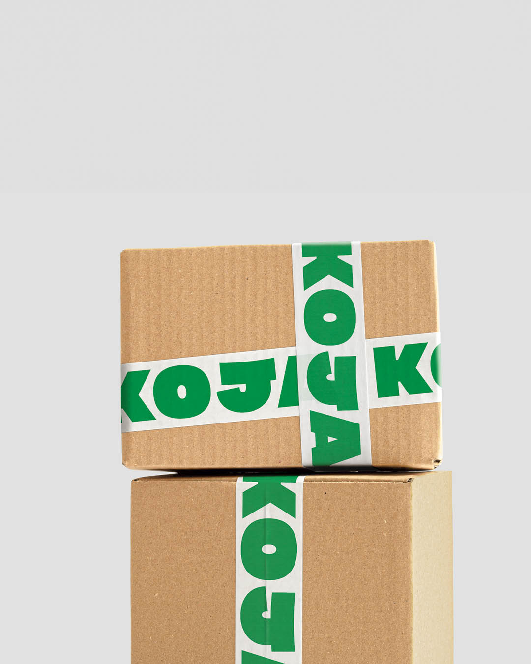
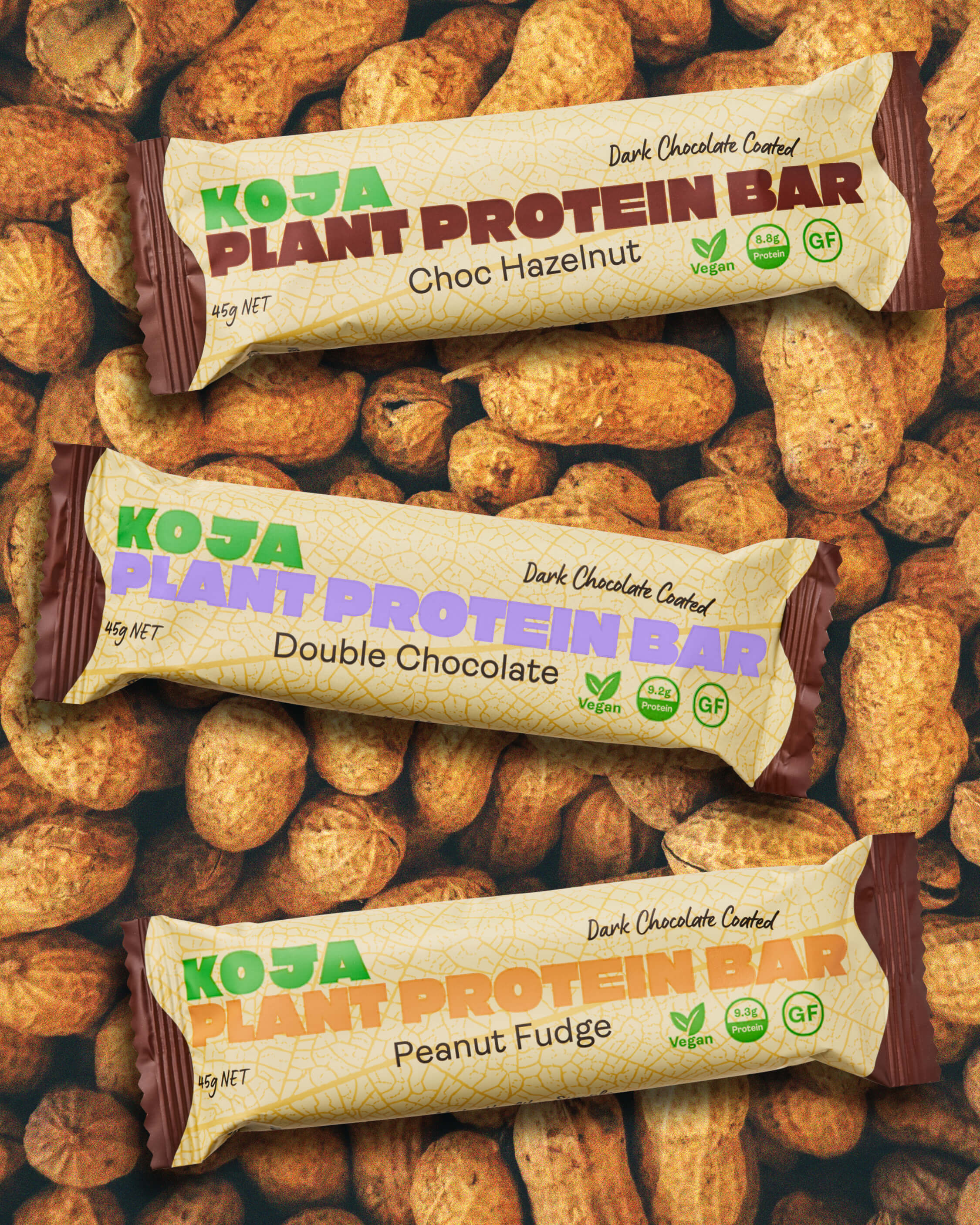
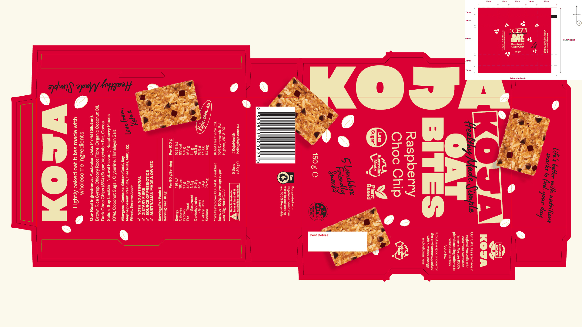
The identity brings Unapologetically Good to life through clarity and character. A bold, confident logotype leads the system, designed to feel instantly recognisable and full of personality, with a subtle grin. A warm, approachable palette signals health without feeling clinical, while hand-drawn assets and ingredient-led illustrations introduce a human touch. Typography moves between strong and expressive, creating a system that feels direct, energetic, and easy to connect with.
The Outcome
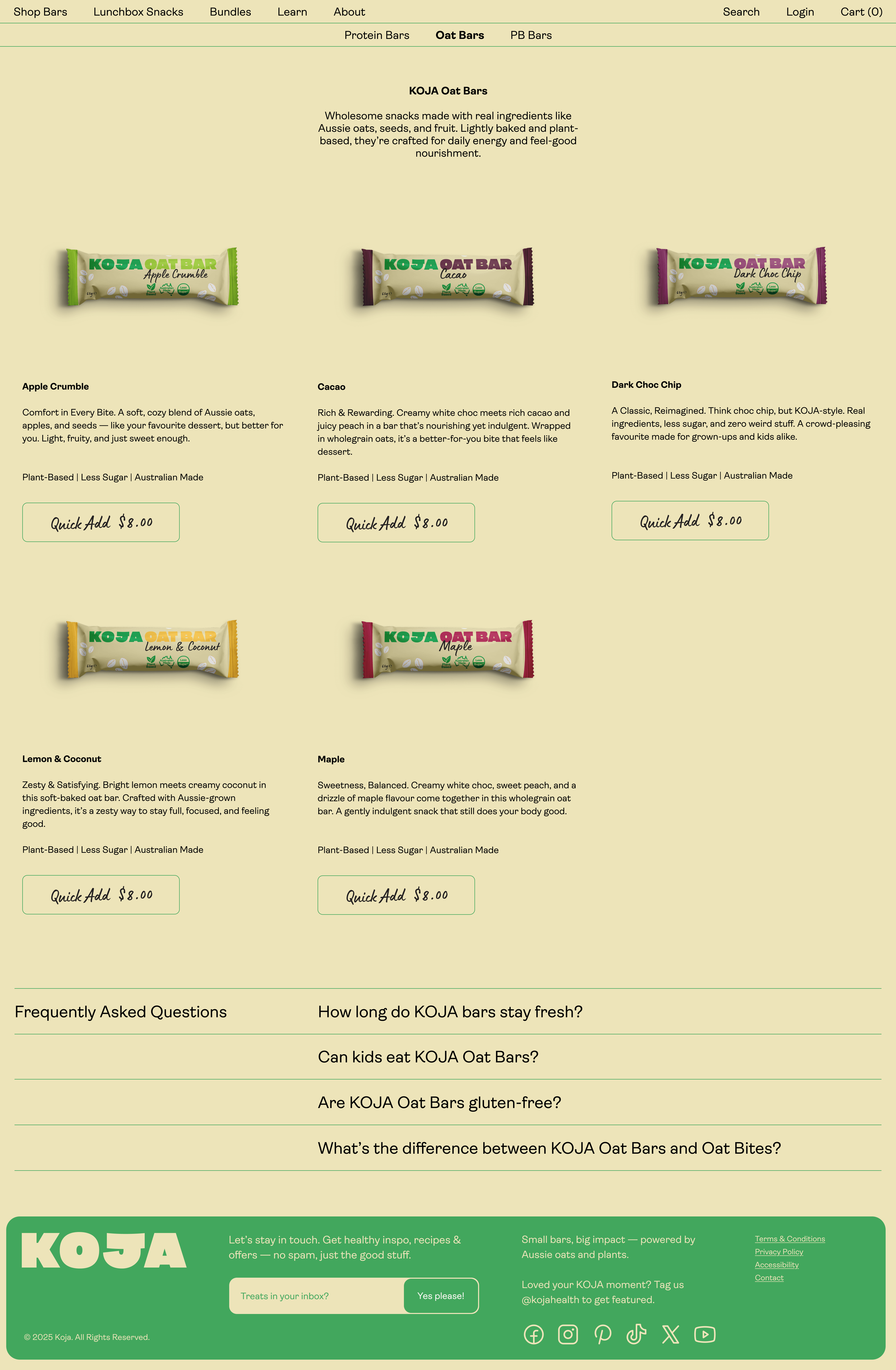
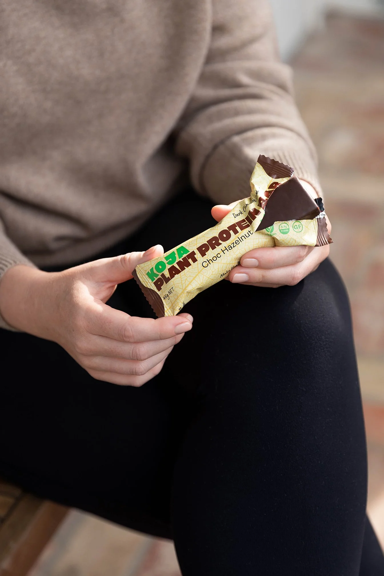
KOJA shifts from a functional product to a brand with presence and personality. It stands clearly on shelf, communicates with confidence, and connects through simplicity rather than explanation. By owning what it is, KOJA becomes a brand that feels as good as it tastes, now stocked nationwide.