Heaps Normal

A Different Kind of Normal

How by WhyClarity for brands at a turning point.

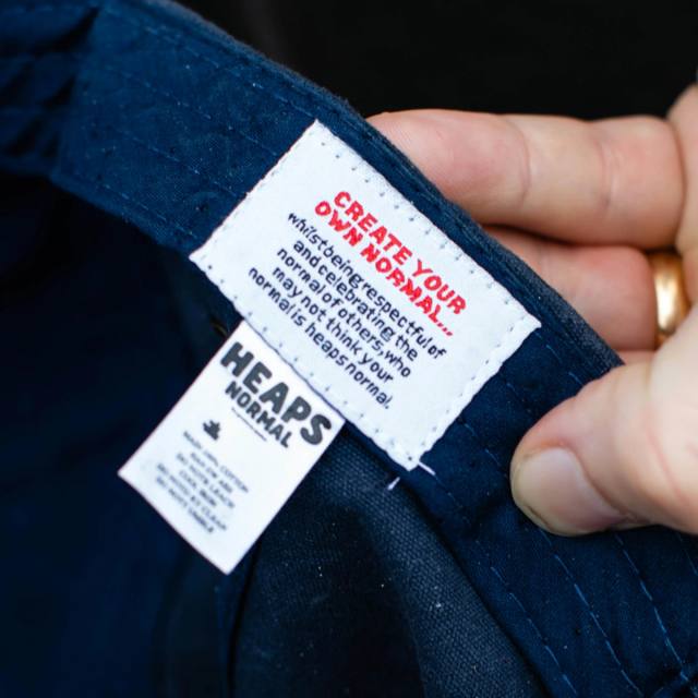
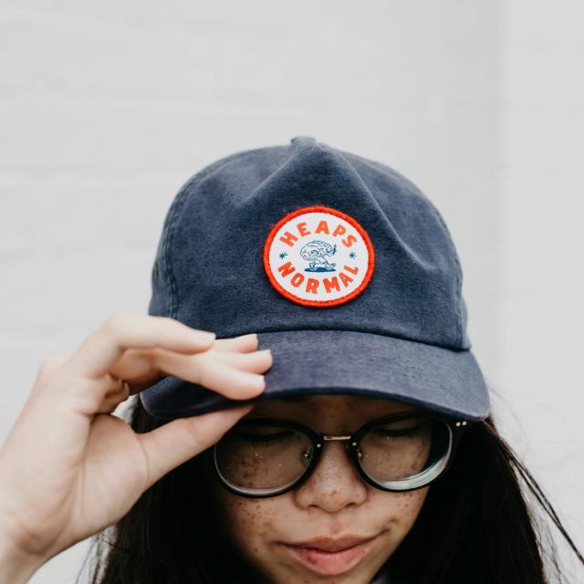
Heaps Normal — A Different Kind of Normal, 2020
Made by Madelen — 2026

Launch strategy, content planning, motion and social content for a fashion label.

The Made by Madelen monogram in cream over a black-and-white portrait, the model in a monogram-print bra and white trousers.

SUB:3 — 2025

Identity, packaging and motion for a new performance nutrition brand.

A coarsely halftoned poster of a runner, SUB:3 ® RUNNING stretched across the frame.

SCK — 2024

Brand strategy, creative direction and visual identity for an architecture studio.

A timber-lined bedroom seen through a fine perforated screen, S.C.K set large across it.

EMISE — 2024

Naming, brand strategy, identity and packaging for a naturopath moving into women’s health.

Emma Wiseman in a cream blazer against black, the Emise. wordmark set across the frame in white.

CLOSED — 2024

Concept, identity, signage and print. The name emerged in the work.

Torn-paper collage of happy-hour type, bottle silhouettes, a bar photo, and plated food.

KOJA — 2024

Brand strategy, visual identity and packaging for an established food brand.

The KOJA logotype assembling letter by letter, the ground changing colour behind it.

Chris Sisarich — 2024

Identity and website for a photographer, built to stay behind the pictures.

Rubble and two blocks of orange-striped stone under a pale sky, a handwritten note pinned above them and a fine blue arc drawn across.

Our Boy Roy — 2022

Visual identity, signage and print.

A white brick shopfront with lilac doors and window lettering, seen from across the road.

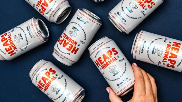
Heaps Normal — 2020

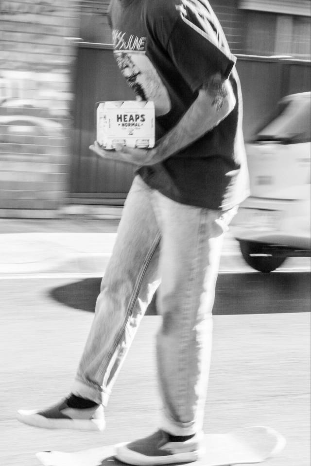
Visual identity for a non-alcoholic beer brand.

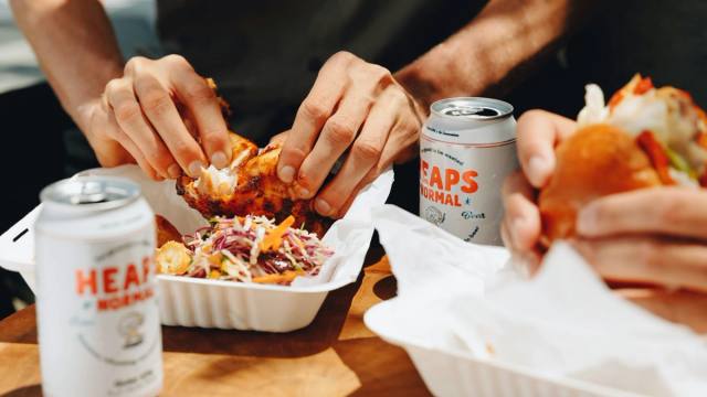
Hands sharing a takeaway meal across a table, two cans of Heaps Normal open beside it.

Wentworth Falls, Blue Mountains, Australia

A note, now and then

Work as it goes out, and the occasional thought about why brands get stuck. No schedule, and nothing else.